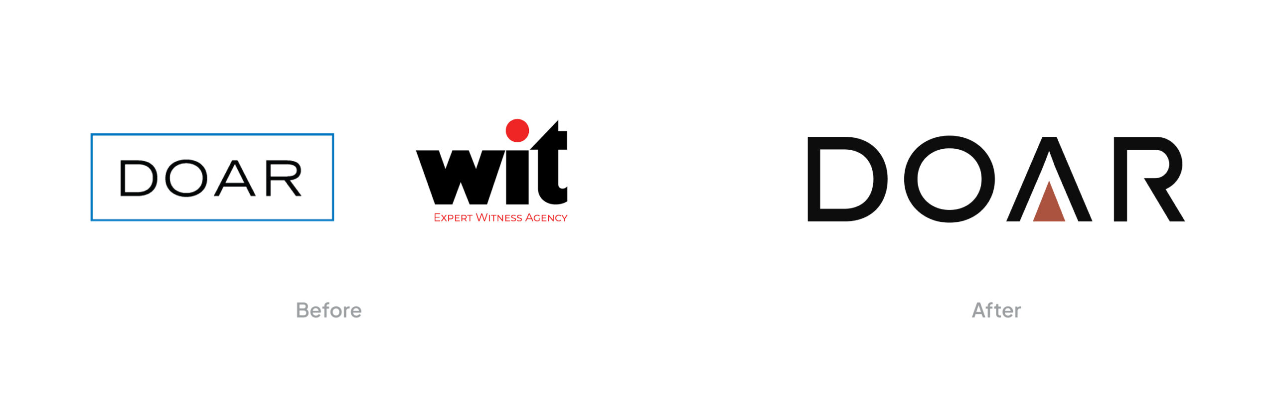
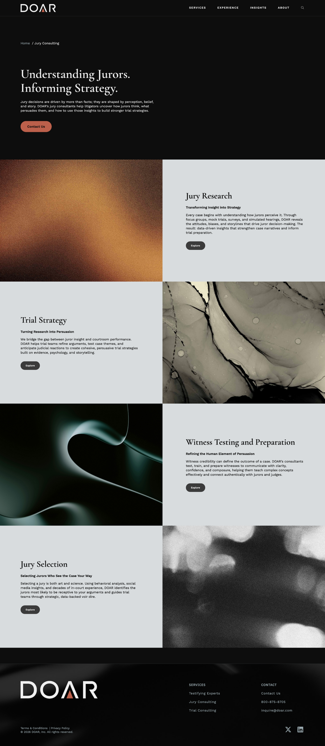
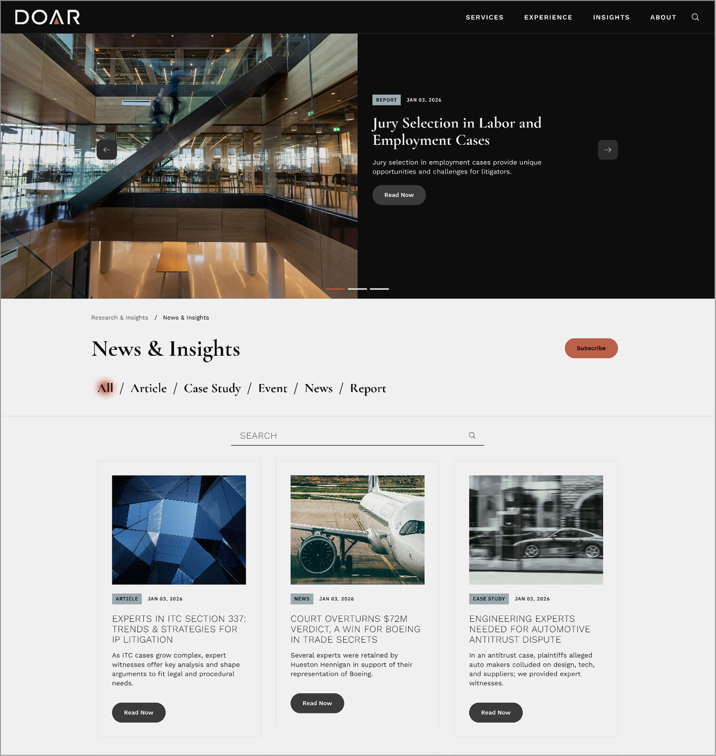
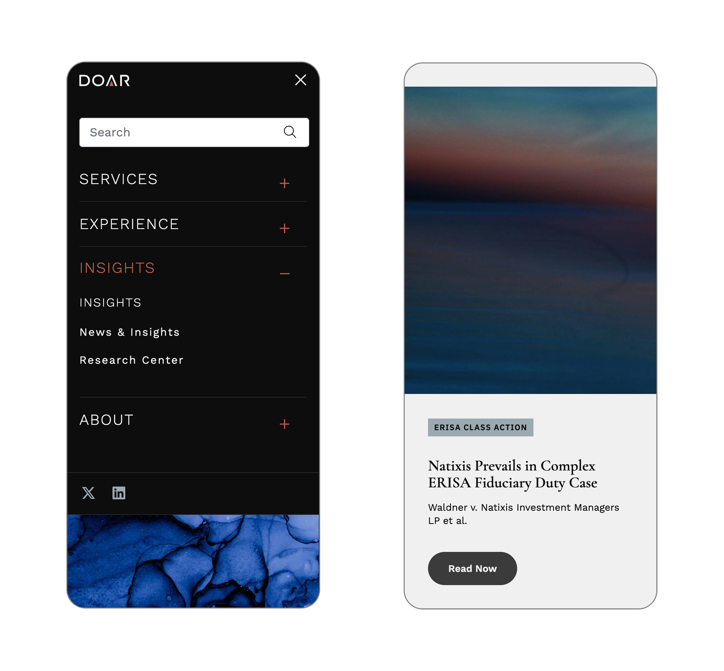
DOAR and WIT came to our team with a major moment of change. After decades operating as separate but closely connected litigation strategy firms, they wanted to unify their identities under one shared brand and build a new website that felt modern, confident, and approachable. Their previous online experiences felt dated, fragmented, and didn’t express the strength, expertise, or personality of the combined teams.
Our objective was to solve three core needs at once:
•
Unify the two companies under one clear brand and online presence.
•
Create a visual identity that stands out from standard legal-industry conventions.
•
Build an intuitive website with straightforward pathways for researchers, trial teams, and general visitors.
Unifying two legacy brands into one modern, strategic digital presence
My Role
UX Designer
Researcher
Acted as the primary UX/UI Designer and Researcher during the project.
Tools
Figma
Wireframed and prototyped the website with Figma, utlitizing its advanced component and layout features to show the client in sprints.
Scope
Fall 2025
This project took place from August - December of 2025.
Our Approach
Discovery
Our discovery work focused on building a clear understanding of DOAR’s goals, audience, and how the unified brand should show up online. We began with a workshop to align with leadership on priorities and identify areas of the current experience that needed improvement. We conducted stakeholder interviews, and we reviewed the insights together to understand how DOAR is perceived and what clients expect from a litigation strategy partner. We also completed a competitive review to identify common UI patterns and places where DOAR could stand out with a fresher, more expressive approach. Using the Brand Strategy Report, we pulled forward the themes and tone that would guide the UX and visual direction.
Creative Direction
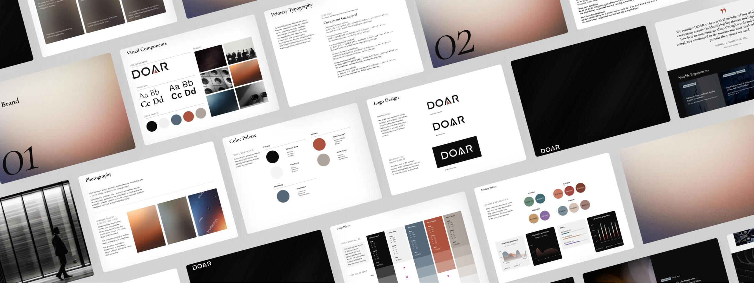
With strategy in place, we moved into defining the visual and structural groundwork for the new brand. We developed mood boards to establish a look that felt modern, confident, and less traditional than typical legal-industry design, while still supporting clarity and credibility. As the identity evolved, we also evaluated how the logo and brandmark would perform across the digital system to ensure consistency, flexibility, and strong visual presence.
The Result
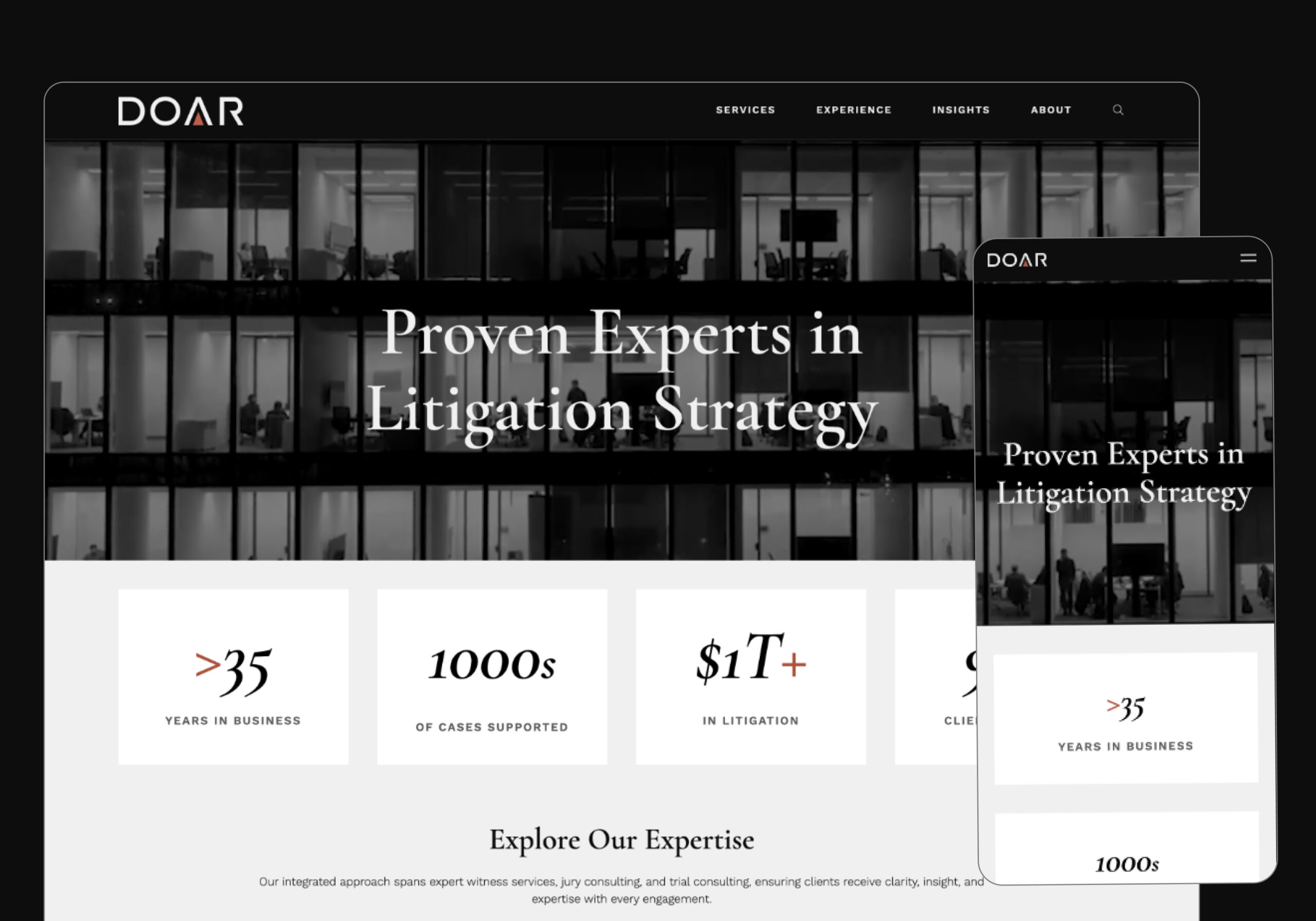
The new DOAR brand and website deliver a clear, unified presence that brings DOAR and WIT together in a way that finally feels cohesive. The updated visual direction gives the company a more modern and confident personality while still supporting the clarity their audience expects. Early feedback from the client has been overwhelmingly positive, especially around the site’s improved structure, intuitive navigation, and elevated design system.
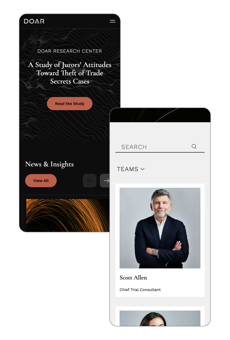
The visual identity now reflects the intelligence and strategic depth of DOAR’s work, and the interface introduces subtle moments of motion and interactivity inspired by the DOAR Research Center. Content is easier to find, pages feel more focused, and the brand no longer blends into the legal landscape. Instead, it stands out in a thoughtful, intentional way.
This foundation positions DOAR to grow, expand content, and roll out additional interactive features over time without needing to reinvent the system.